35 Black Friday Marketing Ideas for E-commerce Sales (2024)
9 September, 2024
How Urgency Can Drive Your Revenue Boost for BFCM
10 October, 2024In today’s competitive and ever-changing e-commerce environment, retaining customers is just as crucial as acquiring new ones. A well-optimized loyalty page can serve as a powerful tool to grow your customer base, turning one-time buyers into repeat customers. With more and more brands adopting loyalty programs, the way you present this program on your site is key to its success.
In this guide, we’ll walk through the steps of optimizing your loyalty page to make it more effective, attract more customers, and drive sustained business growth.
Why a loyalty page is vital for loyalty program growth
A loyalty page acts as the first point of contact for customers who are interested in joining your rewards program. This page must not only explain the program but also entice visitors to sign up and participate. Studies from Harvard Business Review show that increasing customer retention by just 5% can lead to a 25%-95% increase in profits.
Having a clear, engaging loyalty page can help drive this retention. It makes it easy for customers to understand the value of staying loyal to your brand.
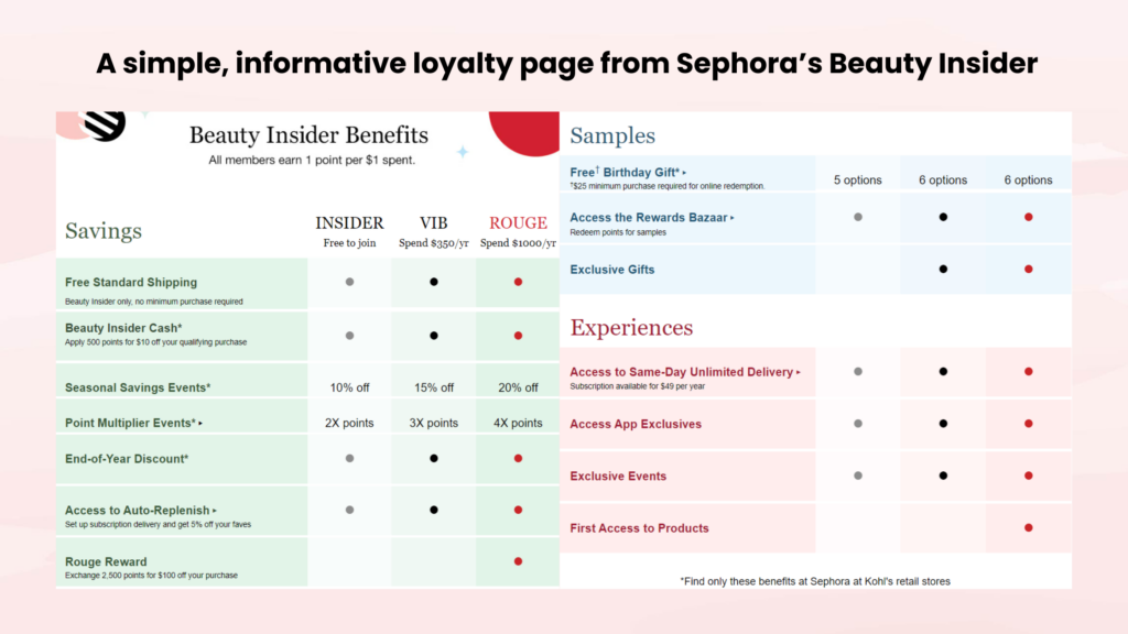
Sephora’s Beauty Insider program is a prime example of a successful loyalty program. The key to their success lies in how they’ve designed their loyalty page. It’s simple, informative, and highlights the benefits of joining.
The page uses clean design elements and clearly explains how customers can earn and redeem points, which has helped them attract millions of loyal customers.
5 key elements of a high-converting loyalty page
A well-optimized loyalty page should do more than just inform—it should convert visitors into members. To achieve this, there are several critical elements your page should include.
Clear and compelling CTAs
Your calls-to-action (CTAs) should be highly visible and encourage immediate action. For example, a button that says “Join Now” or “Start Earning Rewards” should be positioned at the top of the page. Avoid placing CTAs in hard-to-see areas. If visitors have to scroll down to find them, your conversion rates will likely suffer.
A study from HubSpot found that moving a CTA to the top of the page resulted in a 28% increase in sign-ups. A/B testing different placements can help determine what works best for your audience.
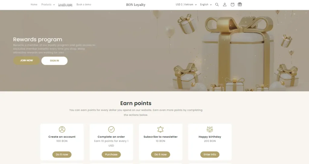
That’s why BON always places the CTA button at the top of the loyalty page, featuring a clear default message. However, you can easily edit the text to ensure it reflects your brand’s personality.
Visual hierarchy and mobile responsiveness
A loyalty page should be visually appealing and structured in a way that guides the visitor’s eye through the content. This is known as visual hierarchy. The three most important elements—how to earn points, rewards available, and tiers—should be easy to locate and immediately visible to visitors. These key components give potential customers a clear understanding of what they can gain by participating in your loyalty program.
It’s also crucial that your page is mobile-friendly. According to Statista, 54.8% of global website traffic comes from mobile devices. If your page isn’t responsive, you risk losing a significant portion of potential sign-ups. Make sure the layout of your dedicated loyalty page adjusts seamlessly to different devices.
Some e-commerce sites with large customer bases opt to develop their own loyalty apps using third-party loyalty platforms. This approach provides them with more customization and features tailored to their business needs.
However, for small and medium businesses (SMBs), it’s more cost-effective and efficient to focus on a mobile-responsive loyalty page. This solution is easier to manage, more budget-friendly, and optimized for businesses that don’t need the complexities of a dedicated app yet.
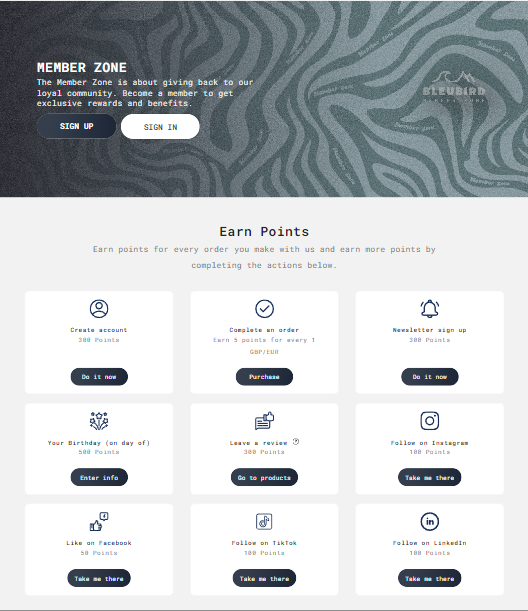
An apparel retailer selected the BON Loyalty app to create its loyalty landing page. By using BON’s editor tools, the content of their loyalty has already been structured to enhance visual hierarchy, the buttons were sufficiently large, and crafted to engage calls to action. Additionally, a collection of ready-to-use icons was included for each earning action.
Program benefits are explained clearly and simply
People want to know why they should join your loyalty program. A vague description won’t cut it. That’s why the clearer you explain your loyalty program, the more likely customers will be to join.
A good loyalty page must outline 4 important pieces of content:
- How customers can earn points
- What rewards can they get? In other words, why they should join your loyalty program
- Why your program stands out from others
- Give answers to all the frequently asked questions (FAQ)
Among all this information, the most important aspect is why customers should join your loyalty program, and this should be highlighted. Customers won’t take the time to sign up for a program if they feel they aren’t receiving anything in return; they want to feel like they’re getting something special.
By highlighting exclusive benefits such as free shipping, free products, or personalized offers, you give your customers a strong reason to join your loyalty program.
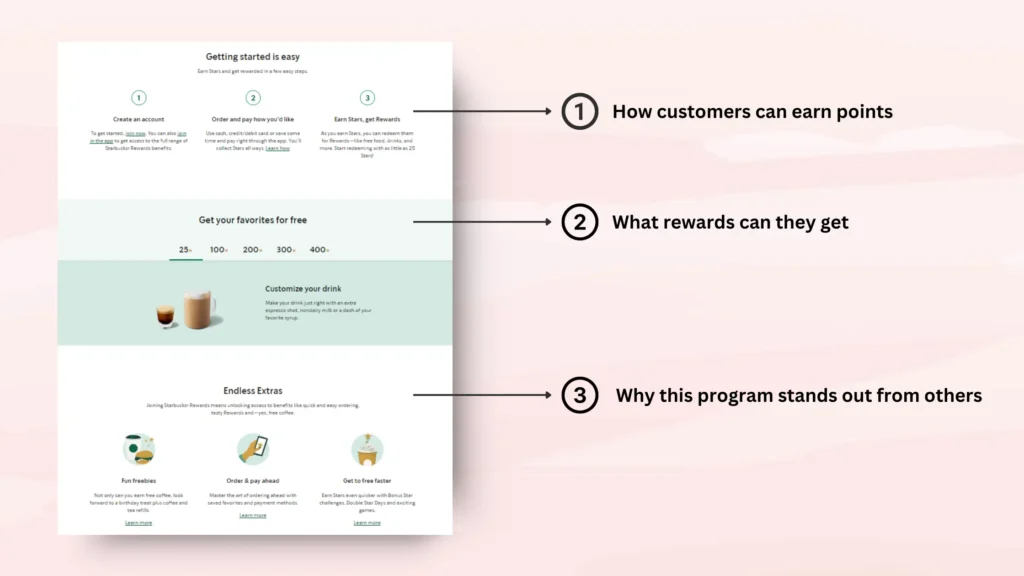
Starbucks Rewards excels at explaining its loyalty program benefits. On its rewards landing page, it clearly explains how customers can earn “stars” for every purchase and what rewards are available at different amounts of stars you have.
From the way they name their points to the rewards they choose for loyalty program members, everything is unique and has created a strong impression in users’ minds. This is why their loyalty program truly stands out among other coffee shops. This simple and engaging explanation has definitely driven sign-ups for Starbucks Rewards.
Customize the color scheme of your loyalty page to reflect your brand
One of the key elements of a successful loyalty page is customizing the branding to match your overall business aesthetic. Your loyalty landing page should mirror the same colors, fonts, and tone as the rest of your brand to maintain consistency.his helps build trust and a seamless experience for your customers.
The recommendation is to create the loyalty page using your brand’s logo, signature color palette, and design elements. This approach ensures that your loyalty page is not just another tool for extracting money from your customers but a space where you genuinely appreciate them. Remember, the very first objective of a loyalty program should be to increase customer loyalty. A cohesive look reinforces brand identity and helps strengthen the emotional connection with your customers.
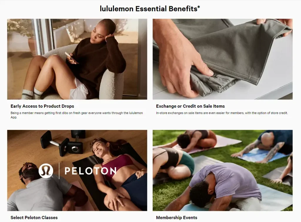
One great reference is the Lululemon membership page. They nail this approach. Their loyalty page reflects their sleek, active lifestyle aesthetic with clean lines and bold typography. The design also mirrors their overall brand personality and appeals to their core audience of fitness enthusiasts.
By customizing the look and tone of your loyalty page, you can make it much more engaging. When it feels intentional and aligned with your brand, it can encourage more sign-ups and deeper customer loyalty.
Integrating your loyalty page throughout your site
Your loyalty page should be visible across your website, not just as a standalone page. We have seen many successful e-commerce stores integrate their loyalty programs into other touchpoints of the customer journey, such as on the navigation menu or on the checkout page.
How to start tracking and optimizing your loyalty page
Once your loyalty page is live, it’s important to monitor its performance and make data-driven improvements. Key metrics such as conversion rates, bounce rates, and average session duration can give you insights into what’s working and what needs improvement.
Tracking conversion rates and bounce rates
The most critical metrics to track should include:
- Conversion rate
- Bounce rate
- Average session duration
A loyalty page’s conversion rate should be calculated as the number of new loyalty members generated from the page divided by the number of visitors to the page over a specific period of time. Some may track it as the number of clicks on the sign-up button divided by the number of visitors to the page.
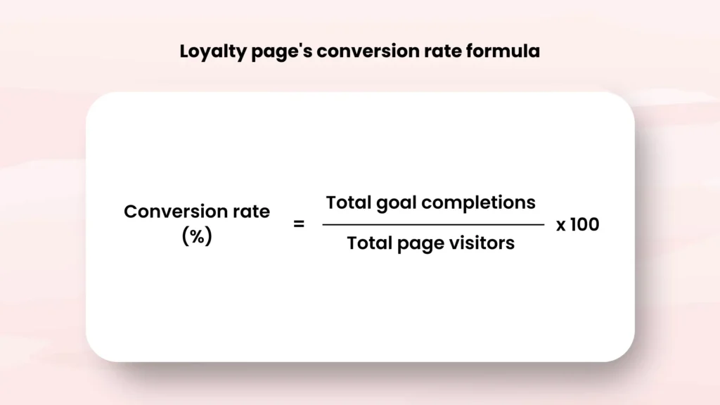
There isn’t just one conversion rate formula; it will vary based on what goal you set for the loyalty page and how many promotional channels you use for your loyalty program. But It’s essential to clearly define how you calculate your conversion rate, as this will influence how you track and optimize it later.
Your conversion rate will tell you how effective your page is at turning visitors into members. If your conversion rate is low, you may need to simplify your CTA or better explain the program’s benefits.
Bounce rate is also an important metric. It refers to how many users leave your page without taking any action. A high bounce rate might indicate that your page is overwhelming or lacks clear direction.
To track these metrics, simply integrate GTM tags and connect your site to GA4. This will ensure that all metrics are collected in the GA4 report.
A/B testing for better results
A/B testing is a method where you compare two different versions of a webpage to determine which one performs better. For instance, testing different CTA buttons or layouts could help you discover small adjustments that yield big results.
Don’t just focus on A/B testing the loyalty page design itself; consider a broader approach by A/B testing and optimizing the entire loyalty program and its promotion strategies. To determine where to implement A/B testing, you need to clearly identify the problem you are trying to solve. If many people visit your loyalty page but few sign-up, the issue may be related to the design of the loyalty page or the rules of the loyalty program. Otherwise, the issue may be related to how you promote and attract new visitors to the page.
Frequently Asked Questions (FAQs) about designing loyalty page
What are the key elements to include on a loyalty page?
Include a clear value proposition, benefits of joining, an easy sign-up button, and testimonials from current members.
How can I effectively highlight exclusive benefits?
Use bold headings, icons, and concise bullet points to showcase benefits like discounts, free shipping, and early access to sales.
How can I make the sign-up process user-friendly?
Make the sign-up process simple. Ask for minimal information and include clear instructions. Another way is to allow your customers to sign in to the loyalty program using their existing accounts on your website. This is also how loyalty programs powered by BON works
How can I promote my loyalty program beyond the loyalty page?
You can share it on social media, include it in email newsletters, and promote it at the checkout page and in-store. Use eye-catching visuals and strong calls to action.
The ultimate loyalty app you need for BFCM success
A well-optimized loyalty page is the cornerstone of a successful customer retention strategy. By focusing on clear messaging, visually appealing design, and strong CTAs, you will absolutely convert more visitors into loyal customers.
BON’s loyalty program is packed with powerful tools to earn loyalty from day one, including an effective loyalty page. All the essential features are available, plus advanced options to boost your BFCM sales: points on the product page, limited-time point offers, automated emails, and more!
Whether you’re a small shop or a large enterprise, our interface makes managing loyalty easy. We’re also here 24/7 to ensure your program delivers real, measurable results!
Lindsey Nguyen is a Content Marketing Specialist at BON Loyalty, specializing in digital marketing and eCommerce. At BON Loyalty, she crafts content that empowers Shopify store owners to build and sustain thriving customer relationships through innovative loyalty programs. Her articles, often featured on the BON Loyalty blog, provide valuable strategies and insights that help businesses enhance customer loyalty and increase customer lifetime value.
