New updates: Discover BON’s new interface and our latest features
22 June, 2024
10 Affordable Loyalty Programs for Businesses in 2024
26 June, 2024Loyalty program landing pages may assist in enhancing brand loyalty and client retention. But you don’t know how to create it? Don’t worry—this post will help you develop a successful loyalty program CTA page.
Why Does A Good Landing Page Matter For Your Loyalty Program?
For your loyalty program, a well-designed landing page is like a storefront. It must be easy to understand to turn users into loyal program members. Here are the advantages that landing page optimization offers:
Increased Conversion Rates:
Industry averages show landing page conversion rates hover around 2.35%, but the top performers can achieve over 5.3%. In simpler terms, a great landing page can increase the number of visitors who join your loyalty program.
Improved User Experience (UX):
A simple landing page will make program applicants happy. A solid UX includes quick browsing, clear program descriptions, and simple registration.
Customer Engagement Strategies:
Landing pages that are well-designed are more than simply a collection of facts. This is a chance to talk to people who could become part of the programme.
Better Customer Retention:
A loyalty program to foster long-term customer relationships. Your landing page plays a vital role in setting the right tone. You may encourage consumers to join by highlighting key program benefits.
Key Elements Of An Effective Loyalty Program Landing Page
We both know your loyalty program CTA page is ideal for attracting new members. However, with so much competition online, a captivating landing page is essential for increasing signups.
The main things that will turn your landing page into a loyalty program magnet are:
- Clear and compelling headline.
- Value proposition.
- Visually appealing design.
- Simple and intuitive navigation.
- Strong and actionable CTAs (e.g., “Join Now,” “Sign Up Today”).
- Customer testimonials and reviews.
- Detailed information about the program.
- Mobile responsiveness.
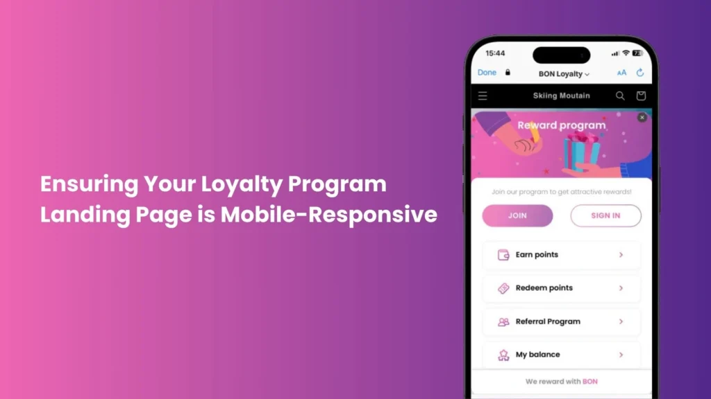
By adding these key elements to your loyalty program page, you can make one that successfully grabs visitors’ attention and eventually encourages program acceptance.
Steps To Create An Effective Loyalty Program Landing Page
Here, we’ll go into a detailed tutorial on how to build a landing page for a loyalty program:
Step 1: Define Your Goals
Before you start designing a loyalty program landing page, you need to know your goal. This will help you measure performance and ensure that the landing page matches your loyalty program strategy.
The following three loyalty program CTAs page objectives are grouped by main focus:
1.1. Program Adoption Goal:
- Increased program enrollment.
- Boosting program awareness.
1.2. Member Engagement Goal:
- Increase member login frequency.
- Drive referral program participation.
- Social media engagement.
1.3. Revenue Goals:
To increase the average order value goal, showing rewards linked to higher spending levels will encourage program members to spend more on each buy.
Following these ideas, you can set meaningful objectives to guide your landing page construction.
Step 2: Research Your Audience
Knowing your goals and your audience’s needs is essential to building an interesting landing page. So, how does audience awareness affect landing page goals?
For Program Adoption Goal:
If your target audience cares a lot about saving money, showcasing program benefits (increased savings, exclusive offers, personalized experiences).
For Engagement Goal:
Focus on incentives that make shopping more enjoyable for frequent shoppers. It’s like special member deals, early access to new goods, or personalized suggestions.
For Revenue Goal:
Encourage higher spending by loyal consumers by offering perks like early access to sales events or exclusive member experiences.
Step 3: Choose The Right Platform
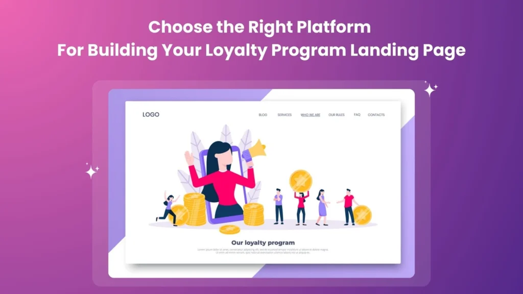
You know what you want to achieve and who you want to reach. Now, pick the tool where you’ll build your landing page. For many online store owners, the best platform has drag-and-drop editors that don’t require code knowledge.
Here are some globally popular drag-and-drop page builder tools to consider:
- Unbounce.
- Leadpages.
- Instapage.
We will introduce these tools in more depth in another section. Keep reading!
Step 4: Design The Layout
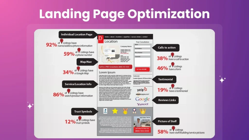
(Source: wp.klientboost.com)
We’re now moving on to designing your loyalty program page style. This is where you’ll clearly show off the program’s benefits and encourage members to join.
Here are some key tips for creating a winning layout:
- Clear communication of program value: Use a short headline highlighting the program’s main value.
- Clear hierarchy: Organize content by using headings, subheadings, and bullet points.
- Visual appeal matters: Images, symbols, and infographics may improve your landing page. Avoid generic stock photographs and use brand—and program-related images.
If you want to know how to design a layout for your loyalty program’s landing page, scroll down and look at the case study and advice in this blog.
Step 5: Craft Compelling Copy
First impressions are very important. That’s why a headline on your landing page is the best way to get people’s attention and interest. Copyblogger’s blog believes the greatest titles meet reader demands and advantages.
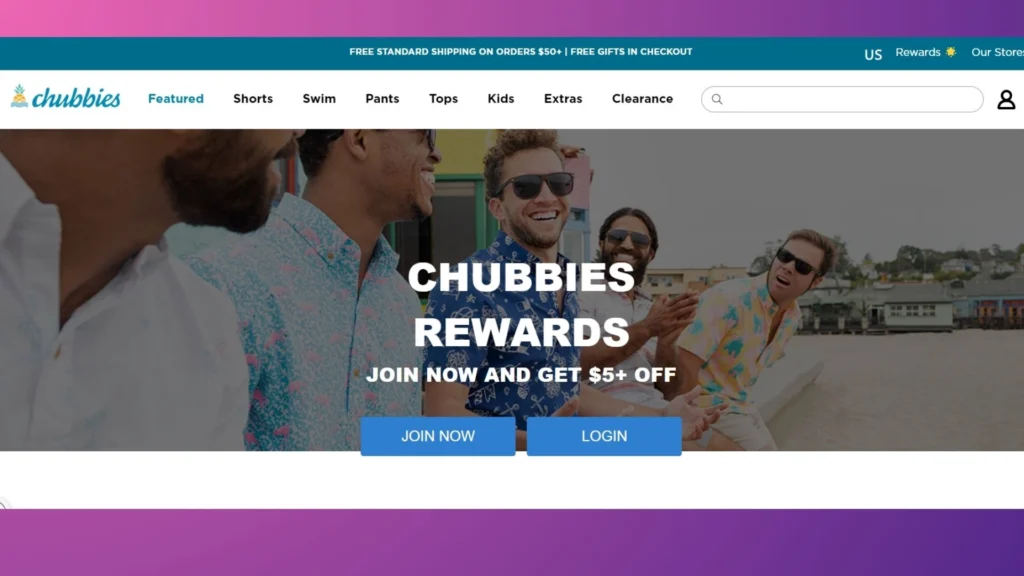
Take inspiration from Chubbies Rewards. Their loyalty program page is titled concisely, “Join Now and Get $5+,” focusing directly on the benefits of joining.
There is some evidence that calls to action that include the phrase “Submit” can lead to a 3% drop in conversion rates. Here are some ideas:
- Points-Based Program: “Start Earning Points Today!” or “Join and Get 100 Bonus Points.”
- Tiered Program: “Level Up Your Shopping: Sign Up for Our Rewards Program.”
- Cashback Program: “Unlock Cashback Rewards: Join Now!”
Your landing page will become a loyalty program magnet by creating a strong CTA.
Step 6: Implement SEO Best Practices
Your landing page is great, but how do you get members to find it? This is where SEO (Search Engine Optimization) comes in. SEO-recommended practices can boost your landing page’s search engine ranking and organic traffic.
Here are some key SEO practices for your rewards program landing page:
- Keyword Research: You can use tools like Google Keyword Planner to help you carry out this task.
- Content Optimization: Focus on natural language and avoid keyword cramming.
- Meta Description: Use keywords to drive traffic to your landing page.
- Backlinks: To organically develop backlinks, promote collaborations, chances for guest blogging, or social media mentions.
Since SEO is an ongoing procedure, monitor your outcomes to ensure that your target audience can still find your loyalty program page.
Step 7: Test And Optimize
Results maximization is mostly dependent on ongoing testing and optimization. Track some key metrics below:
- Conversion Rate: Track the number of landing page visitors who sign up for programs.
- Click-Through Rate (CTR): Measures CTA button efficacy.
- Bounce Rate: The proportion of landing page visitors that depart after one page. High bounce rates show a lackluster landing page.
- Time Spent on Page: The average time visitors spend on your landing page.
Also, A/B testing lets you compare many landing page variants to see which drives program signups the best.
By measuring the success of your loyalty program page with analytics, you can identify areas for improvements on your page.
Best Practices For Designing A Loyalty Program Landing Page
Here are excellent practices for building a loyalty program page that engages your target audience and successfully explains its advantages:
Keep It Simple
COLLOQUY Loyalty Census’s report found that 37% of consumers prefer simple loyalty programs. The last thing you want is for potential loyal members to get lost in a maze of information.
That’s why you should:
- Logical Flow: Start with a clear overview of your program, then explain its benefits and how users can earn rewards.
- Easy Action: Place the loyalty program signup page in a prominent location with a clear call to action.
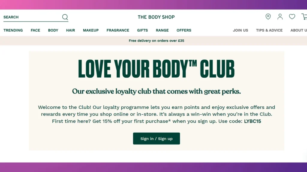
Additionally, consider providing an FAQ section for the loyalty program. This can include who can join a program when points expire, how many rewards you can get, or how to handle your account.
You can get people to join your program by putting user experience first and making access easy.
Use High-Quality Visuals
British researchers have found a link between a website’s appearance and perceived credibility. To promote your loyalty program, you should invest in high-quality photos and graphics.
Maintain your rewards program landing page consistency with website design. Use the same color schemes, fonts, and logos throughout your website. This creates a sense of familiarity and reinforces trust with visitors.
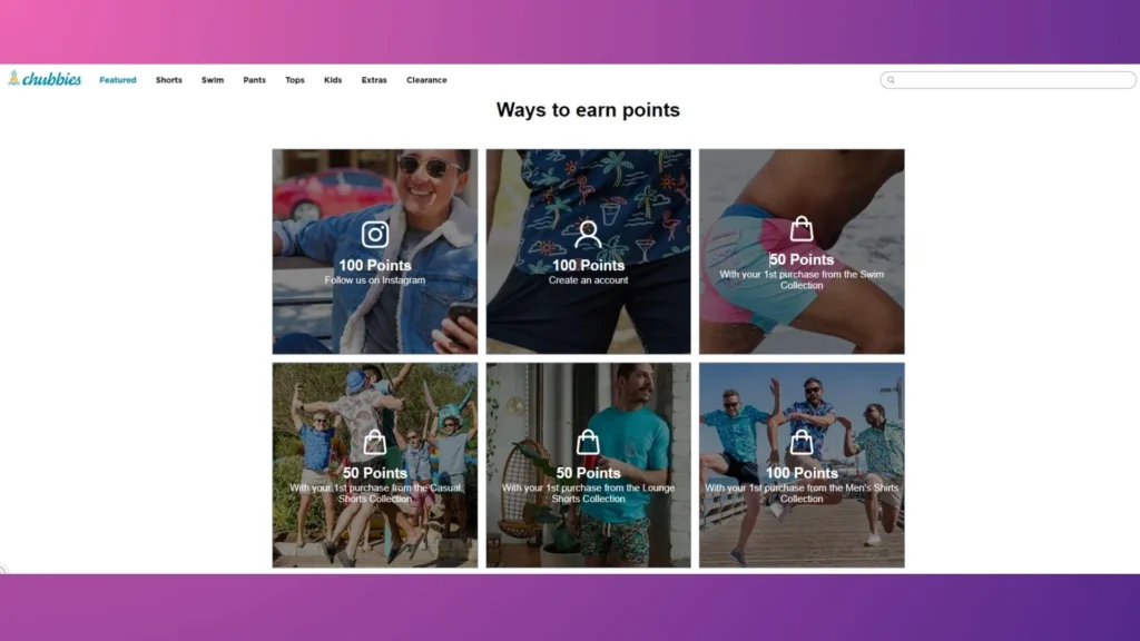
As Chubbies Rewards do. Instead of listing ways to earn points in plain text, they integrate images and icons into their instructions. This visual approach makes the information more attention.
Highlighting Key Program Benefits On Your Rewards Program Landing Page
As Anne Schultheis, loyalty marketing manager at a frozen yogurt store sweetFrog, points out:
“You don’t want to be giving free rewards out every other visit, but you also don’t want them to feel like they never earn anything.”
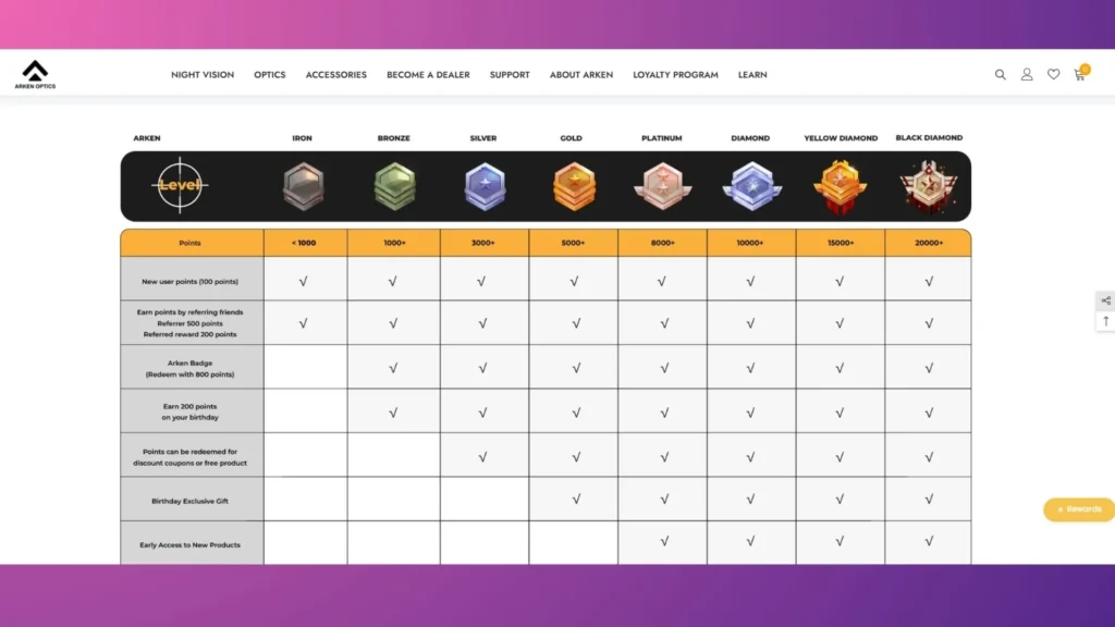
If your program has different levels or tiers of membership, describe the perks and requirements for each level. Some things are easier to understand when they are shown visually, as maps or diagrams like Arken Optics do in the image below:
Ensure Fast Load Times
A one-second lag in mobile landing page loading time might lead to a seven percent drop in conversion rate. With a daily sale of $500, it amounts to over $13,000 in a year.
That’s why you should follow our strategies to ensure your loyalty program page loads quickly:
- Image Optimization: Use tools to reduce the size of pictures without losing quality.
- Minify Code: Minifying your HTML, CSS, or JavaScript landing page code removes extra characters like spaces and line breaks, making the file smaller and faster to load.
- Leverage Browser Caching: Caching lets browsers keep local things like pictures and scripts that are used a lot. This means that they don’t have to be downloaded again on future trips, which makes load times much faster.
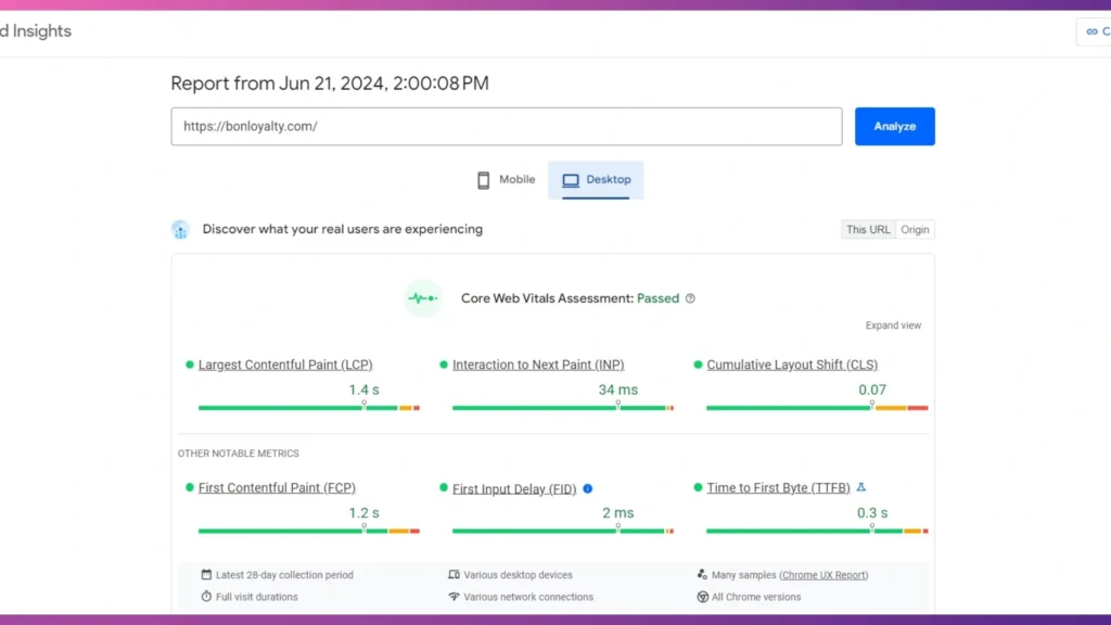
Finally, don’t just think that everything will improve after you’ve used these tactics. Use tools like Google PageSpeed Insights to test your website’s speed and find places where it could be faster.
Leverage Social Proof
Getting potential members to trust you is important for getting them to join your reward program. In doing this, social proof can be a very effective weapon.
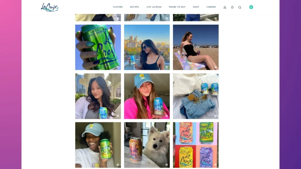
You can integrate social media sharing buttons on your loyalty program landing page. Then, include a live feed from your social media accounts highlighting good program remarks or customer reviews.
One excellent example is La Croix. On sites like Instagram, they urge users to use the hashtag #livelacroix. Then, La Croix chooses the most eye-catching images and posts them on their website.
Read more: 14 Ways To Get More Customer Reviews.
Examples Of Effective Loyalty Program CTA Pages
Now that you know what to include on a loyalty program CTAs page, the next step is to look at several samples to get a feel for what works:
Example 1: Starbucks Rewards
Starbucks knows how to make landing pages for reward programs people want to visit.
To start with, the headline of Starbucks’ ad campaign, which reads: “FREE COFFEE IS A TAP AWAY,” is eye-catching and straightforward. The primary advantage of the program, the ability to earn “Stars” for rewards, is conveyed in this summary.
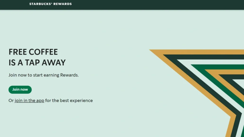
Also, Their clear instructions on joining the program made the experience smooth. With high-quality images of Starbucks’ iconic beverages, they display members’ perks, like free coffee, birthday gifts, and unique goods.
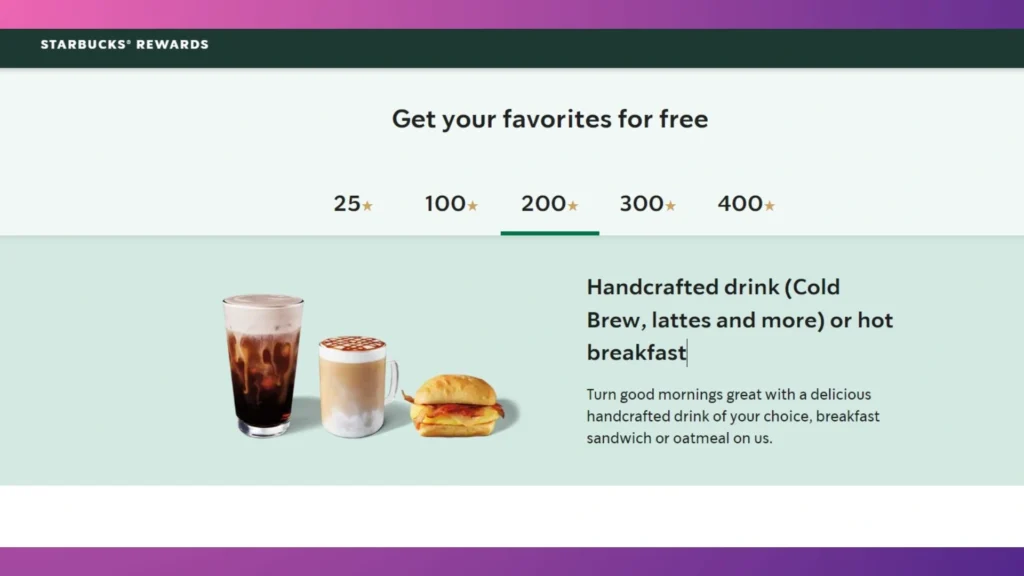
Finally, people can easily move between sections like “FAQs,” “How it Works,” and “Rewards,” which lets them learn more about the program with little effort. If you look at great examples like Starbucks, you can learn a lot and get ideas for making your landing page optimization.
Read more: Lessons from Starbucks loyalty program.
Example 2: Sephora Beauty Insider
Sephora’s Beauty Insider program page is a great example of the strategic integration of relevant products.
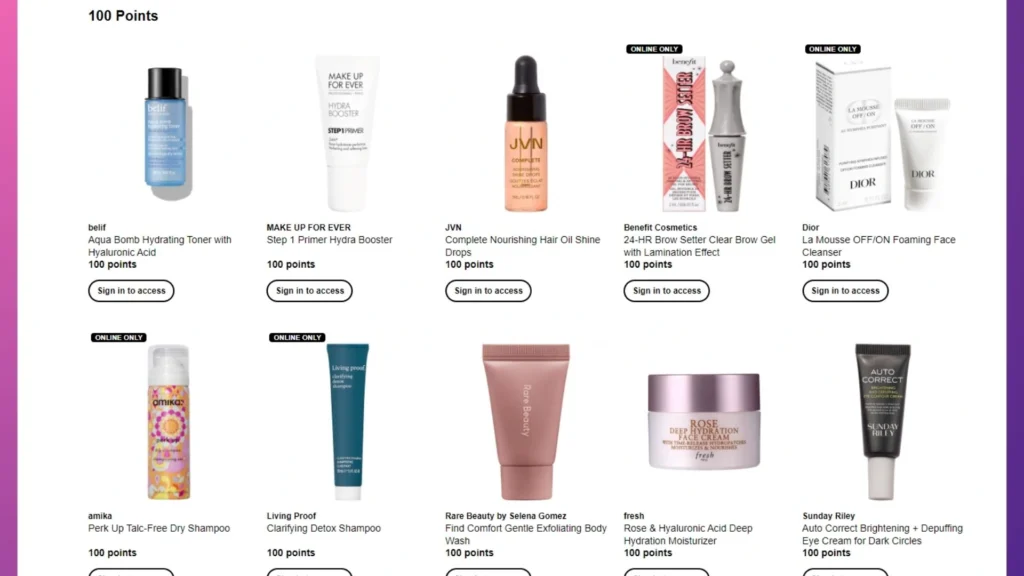
By showing appealing beauty items that can be redeemed with points, Sephora directly meets the needs of its target audience. This is made up of beauty fans who love trying new things and discovering new things.
Read more: Decoding Sephora’s Beauty Insider for E-commerce Growth.
Example 3: Nike Membership
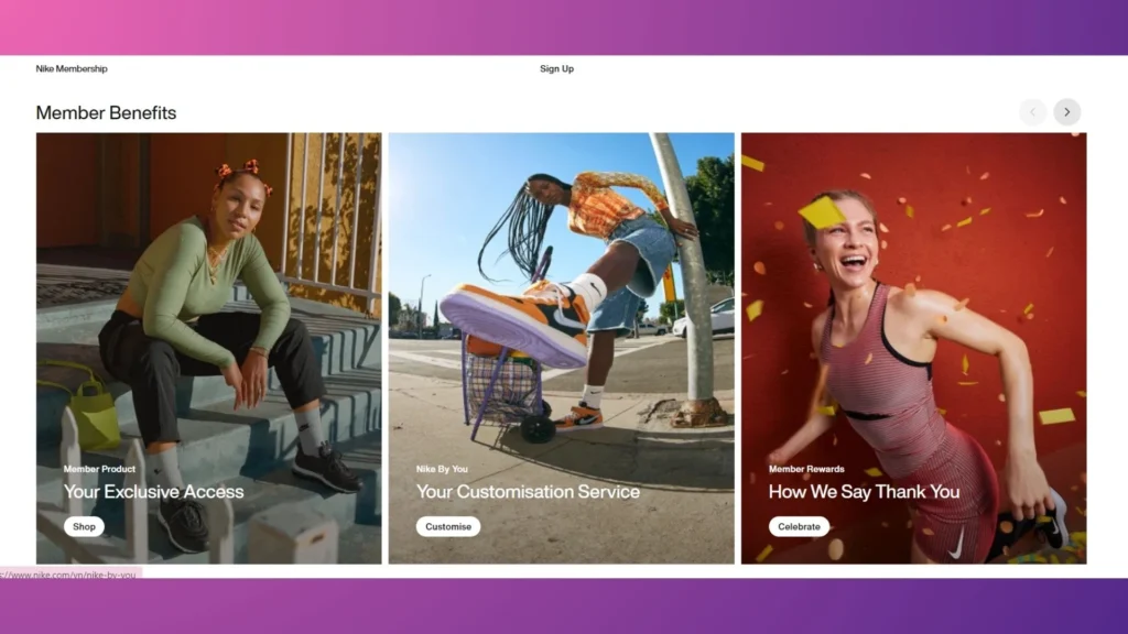
Moving beyond the world of beauty, the Nike Membership landing page is a great example of a reward program landing page that drives participation.
Nike knows that its customers are different. That’s why their main page has sports-specific material for runners, coaches, and basketball enthusiasts. This customization helps members feel connected and valuable by showing them sports-related benefits.
It also works as a mini-content hub with stories of athletes, workout routines, and motivational training tips.
Tools And Platforms For Creating Rewards Program Landing Pages
You understand how important a landing page is for your loyalty program and how to provide interesting material and an engaging user experience. But how can you realize that vision? Choosing the appropriate tool selection for the task is the key.
Unbounce
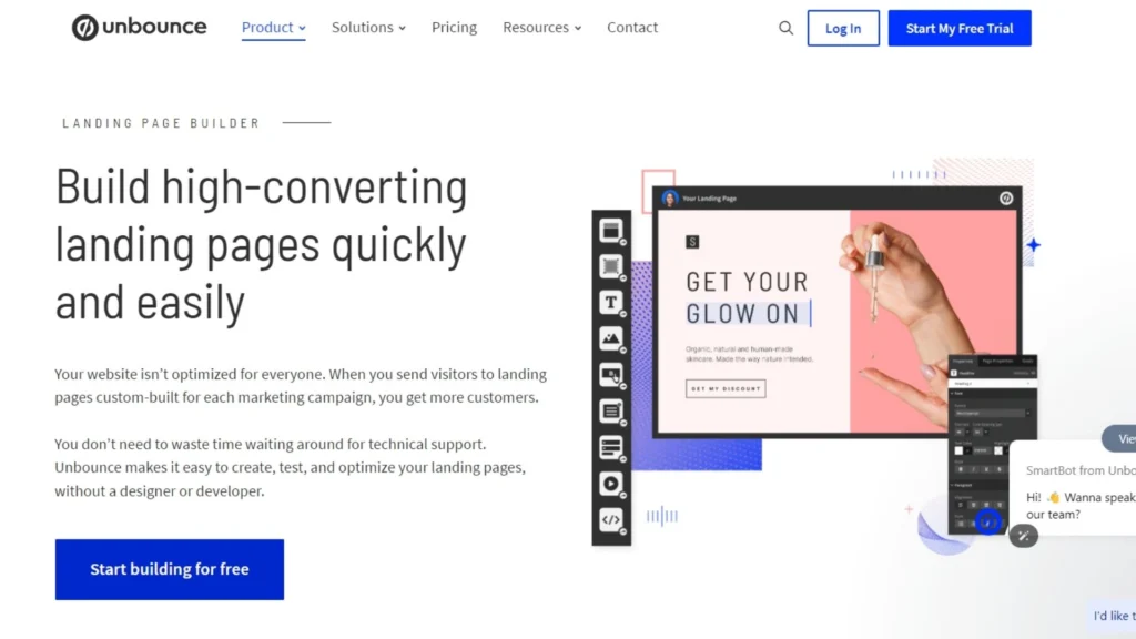
With Unbounce’s easy-to-use layout and pre-built themes, small businesses can make landing pages that look professional even if they don’t have a design team.
Rating in 2024: 4.5/5 ⭐ (257+) in capterra.com.
Key Features:
- Drag-and-Drop Builder.
- 100+ Landing Page Templates.
- Seamless Integrations: Unbounce works seamlessly with CRM, email marketing, and analytics systems, saving time and optimizing processes.
- Engaging Popups & Sticky Bars: These eye-catching conversion tools promote special deals, program perks, and lead generation.
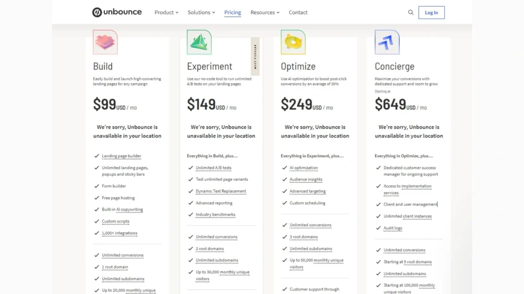
Pricing:
Leadpages
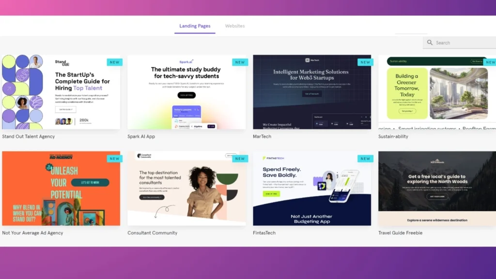
Leadpages lets you create a professional landing page quickly and easily.
Rating in 2024: 4.6/5 ⭐ (294+) in capterra.com.
Key Features:
- 250+ Conversion-Optimized Templates.
- Mobile-Responsive Design.
- Easy Customization: Simply change colors, add your logo, edit images and text, and create a landing page that resonates with your target audience.
- Pre-written Conversion Copy: Leadpages templates include conversion-focused text to recruit new loyalty program members. This saves time and ensures your landing page conveys the program’s value.
Pricing:
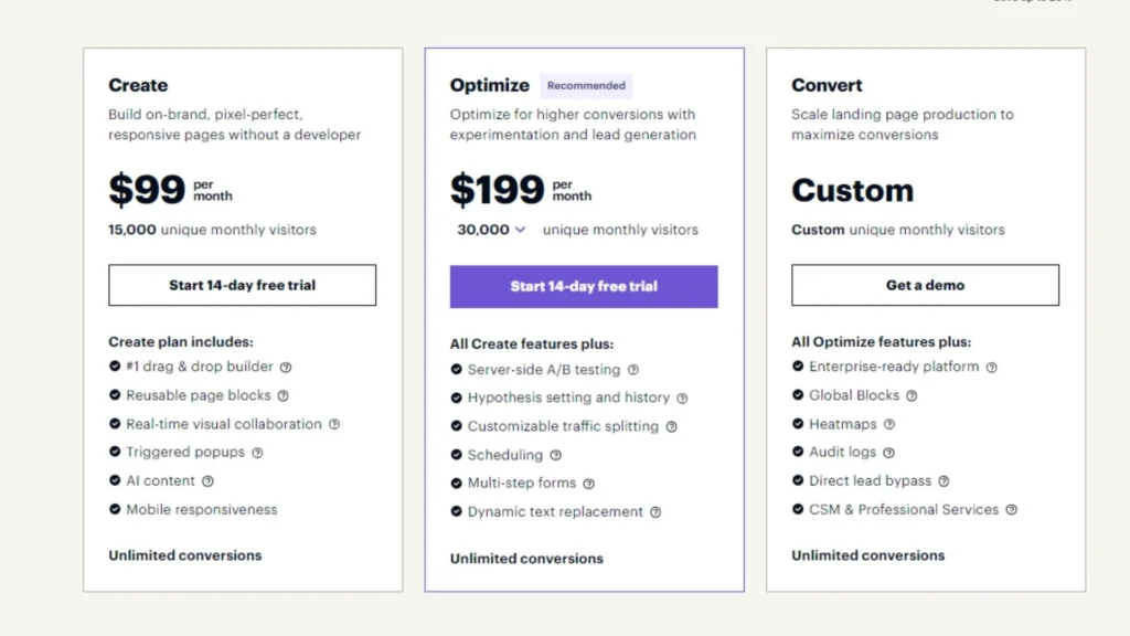
Instapage
With its robust features, Instapage empowers you to create impactful landing pages that convert visitors into loyal members.
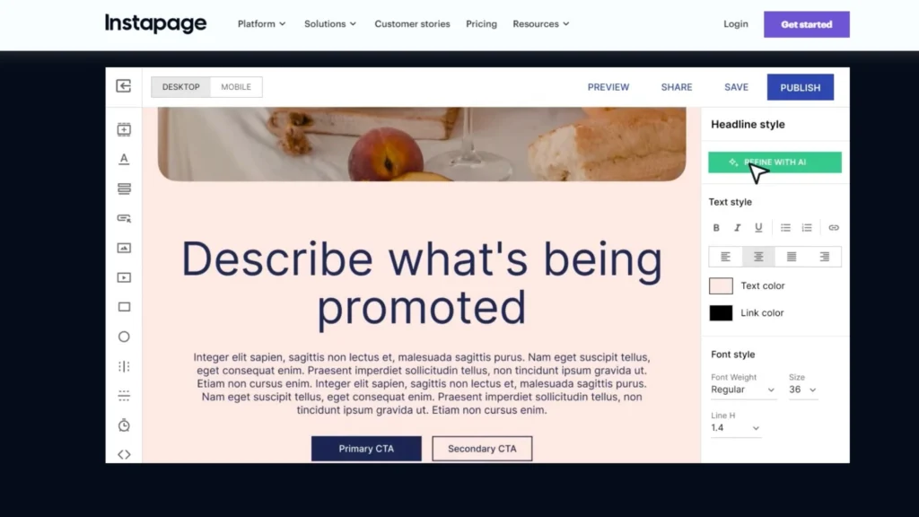
Rating in 2024: 4.7/5 ⭐ (11+) in capterra.com.
Key Features:
- 500+ Customizable Layouts.
- Built-in Collaboration Tools.
- AI-Generated Content: Customise headlines, paragraphs, and calls to action for your audience and ad group instantly.
- Instablocks® & Global Blocks: Make content blocks (Instablocks®) that can be used repeatedly and quickly added to different landing pages.
Pricing:
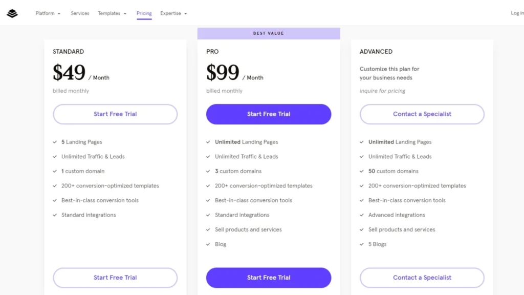
HubSpot
HubSpot offers a powerful set of features that can build effective landing pages for your loyalty program. Especially if you’re already using their CRM or marketing tools.
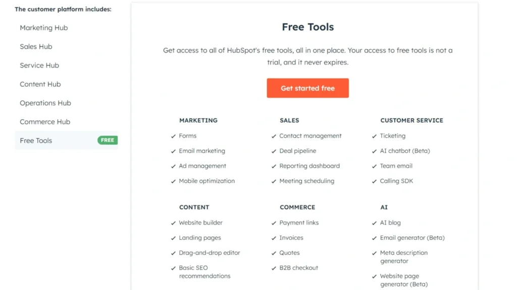
Rating in 2024: 4.4/5 ⭐ (10,964+)
Key Features:
- Pre-Built Templates.
- CRM Integration (if applicable): Your HubSpot CRM-integrated landing page works flawlessly with your contact database.
- Marketing Automation Tools: You might automatically send new loyalty program members and give interest-based benefits.
- Built-in Analytics: HubSpot’s A/B testing allows you uncover the optimal program enrollment landing page designs and messaging.
Pricing:
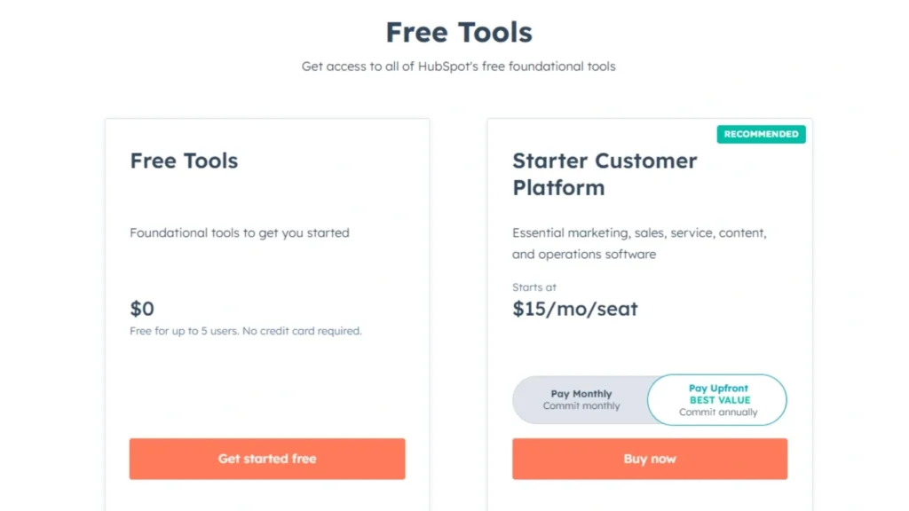
Mailchimp
If you’re currently using Mailchimp and need a basic landing page for your loyalty program, its builder is helpful.
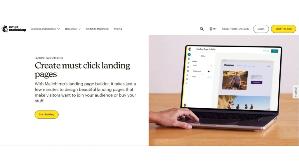
Rating in 2024: 4.5/5 ⭐ (16,899+)
Key Features:
- Pre-Built Templates.
- Drag-and-Drop Functionality.
- Seamless Integration: Your landing page works seamlessly with Mailchimp email lists.
Pricing:
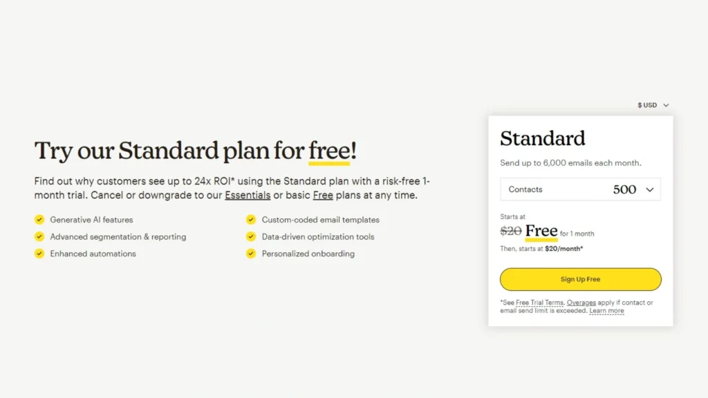
Conclusion
By using the advice in this blog post, you can create a landing page that draws in new members and has a high conversion rate. Don’t forget landing page alone won’t work; you need software to handle the loyalty program.
Don’t forget landing page alone won’t work; you need software to handle the loyalty program.
Need to find loyalty program software for the Shopify store? You might want to use BON Loyalty. Our platform lets you make a fully customized reward program, including:
- 18+ point-earning customer involvement acts.
- Unlimited loyalty program incentives.
- Strong referral program for program expansion.
- Custom VIP levels for distinct consumer categories.
For further advice on creating a good rewarding loyalty program, read our blog.
FAQs
What are the key elements of an effective loyalty program landing page?
Here are the key elements of an effective loyalty program CTAs page:
- Clear Value Proposition: Highlight the benefits of joining the program, like exclusive discounts, rewards, and early access.
- Compelling Visuals: Use attractive images and graphics to showcase program features and rewards.
- Easy-to-Understand Information: Explain the program clearly and concisely, outlining how to earn and redeem points.
- The loyalty program call to action (CTA) page should have a clear CTA button.
- Mobile-Friendly Design: Ensure a seamless experience for users accessing the page on their mobile devices.
How do I optimize my landing page for SEO?
Here are some key ways to optimize your landing page for SEO and improve its search engine ranking:
- Keyword research: Locate terms with high search volume that your target audience uses to locate loyalty programs or similar companies.
- Target keywords: Your landing page’s title tag, meta description, headers, and body material should organically include these keywords.
- High-quality content: Create valuable content on your loyalty program and its benefits for potential members.
- Mobile-friendly landing page design: Google prioritizes mobile-friendly websites in search results.
- Internal linking: Create links from relevant website pages to your landing page. This helps search engines value your landing page and rank it higher.
By implementing these SEO best practices, you can increase your landing page’s visibility in search results.
What tools can I use to create a landing page for the loyalty program?
Here are some common choices:
- Mailchimp: Ideal for simple landing pages.
- Unbounce works really well for building coding-free.
- Leadpages is perfect for generating feature-rich landing pages.
- HubSpot is for firms who already use HubSpot’s CRM and marketing solutions.
Don’t hesitate to explore free trials offered by many of these platforms to get a hands-on feel before committing.
Lindsey Nguyen is a Content Marketing Specialist at BON Loyalty, specializing in digital marketing and eCommerce. At BON Loyalty, she crafts content that empowers Shopify store owners to build and sustain thriving customer relationships through innovative loyalty programs. Her articles, often featured on the BON Loyalty blog, provide valuable strategies and insights that help businesses enhance customer loyalty and increase customer lifetime value.
